We’re still thinking about ways to make it easier for even beginners to understand and give input to the roaster when it comes to the results of roasting with a certain profile. One way we’ve found to help is by using a spider web chart to visualize the distribution of flavors. These charts are great for quickly comparing multiple variables at once. Each variable is represented by a different axis, and the dots on the chart have values that correspond to each axis. This helps you quickly see the relationship between each variable and characterize your coffee roasting profile.
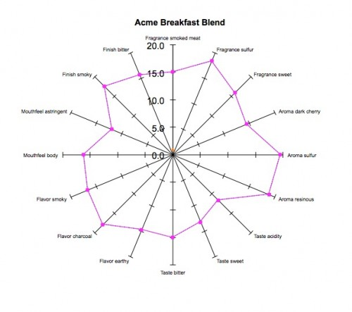
However, it’s important to keep in mind that spider web charts only show correlations between variables and not their importance. They can also be pretty complex, so it’s a good idea to collapse the variables before graphing them.
So, while spider web charts are useful, it’s better to use them in combination with other graphs to understand the data better. Some other types of graphs that you could use include histograms, line charts, box plots, and scatter plots. These can help you understand things like the distribution of variables or correlations between variables.
- Histogram : A histogram is a method of displaying the frequency of a variable as a bar graph. Coffee roasting profiles are useful for determining the distribution of variables such as roast time or color of coffee beans.
- Line Chart : A line chart is a graph that shows changes over time. The coffee roasting profile can show the temperature or humidity of coffee beans according to the roasting time.
- Box Plot: A box plot is a graph that represents the distribution of data as boxes and lines. In the coffee roasting profile, you can show the distribution of each variable and check if there are any outliers.
- Scatter Plot : A scatterplot is a graph that shows the correlation between two variables. Coffee roasting profiles are useful for understanding the relationship between roast time and variables such as the color of the coffee beans.
When you use all of these graphs together, you can get a much better sense of the taste distribution of coffee roasting profiles and the overall nature of the data.
I’m still thinking about how to approach maximal information delivery while simplifying the user UI. Got any cool ideas?